Saturday is a rugby day. So when you are about to put on your jersey, think about some the ugly ones, some poor sod has had to put on and proudly display. This article is courtesy of our friends at Millet Sports.
London, England – Sports fans will go out of their way to show their support for their club or country. Thousands of fans will head to a stadium to try and roar their team onto victory come rain or shine, for example, as well as pay through the roof just to get to the special matches like a World Cup final or a vital cup game.
The support continues even when the action comes to a close, with replica strips selling by the boatload from specialist sports stores like Millet Sports every time a new league season or cup tournament approaches. However, fans sometimes have to sacrifice their fashion sense just to show that they would go to great lengths to be loyal to their beloved club or country. Below we detail a selection of strips which even the most passionate of supporters would have to admit are among the worst rugby kits ever designed:
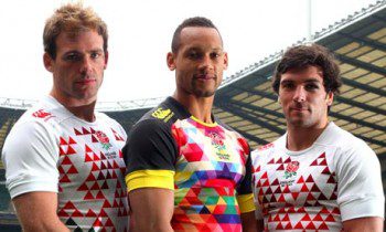
2013/14 England Sevens change kit
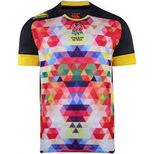 The home strip that the England Sevens wore for this year’s World Cup and have to don again for the 2013/14 HSBC World Series almost made its way into this list. However, the white kit that comes complete with a pixelated image of the iconic red rose has been overshadowed in the fashion disaster league by the team’s change shirt.
The pixelated approach remains intact, but designer Canterbury has opted to zoom in on the images and splash even more color into the arrangement. The result is something you would see if you looked through a kaleidoscope. Canterbury’s defence was that “the colors of the rose blend together to demonstrate the fluidity and speed involved in the game”. That is one way to look at the approach.
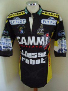
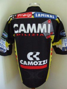 Calvisano kits from the early noughties
Sponsorship is common on sport kits today – the standard club strip will have the logo of the strip maker on the left-hand breast and a massive logo of another company somewhere around the chest area. However, Italian club Calvisano went a little extreme when it showed how much support it was getting in the marketing scene in the early years of the new millennium.
During this time, fans of the team saw not one but two large logos adorn the chest region, a pair of sponsors on each shoulder and a collection of brands all the way down the sleeves. Wait, we’re not finished – there was also a logo etched along the collar and another brand stretched out down the side of the top. It was a challenge trying to find the actual team emblem on the strip at times.
 Stade Francais kits – take your pick
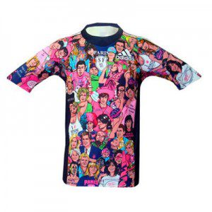
The person who took up the job of picking the official strip for French rugby club Stade Francais over the past few years clearly did not take notice of learning from one’s mistakes. Putting it simply, the Parisian club are one of the worst repeat offenders where crime against fashion is concerned. Picking the worst of the bunch is particularly difficult. Fans of the team are sure to remember the Andy Warhol-inspired top that featured multi-coloured images of the wife of Louis VIII, Blanche de Castille, across the front.
Then there is the confusing strip which appeared to have a number of famous people fighting for a spot on the kit, not to forget that infamous pink top. Although the choice of colour left some supporters bemused with the latter strip, it was a large portrait of Blanche de Castille surrounded by flowers that had fans scratching their heads in confusion.
That’s it for now… feel free to comment below, look for and “Like” our Facebook Rugby Wrap Up Page and follow us on Twitter @: RugbyWrapUp, Junoir Blaber, DJ Eberle, Nick Hall, James Harrington, Cody Kuxmann and Declan Yeats, respectively.
And until the next time… stay low and keep pumping those legs.

